LINEN & ROOTS
Project Focus
Developing a cohesive brand identity and multi-touchpoint design system for Linen & Roots, a seasonal meal plan service centered on whole foods, wellness, and accessible nutrition.
Overview
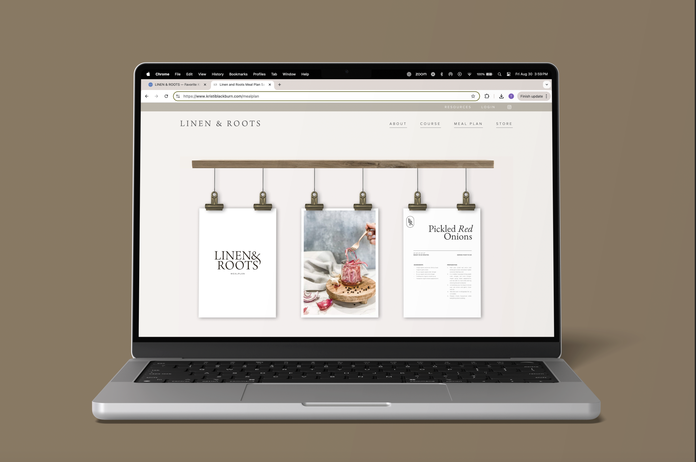
Linen & Roots needed a clear visual identity and digital presence that reflected its mission: promoting wellness through fresh, organic, seasonal ingredients. My role included building the brand foundation, designing the website and core materials, and creating an experiential activation that visually communicated the company’s holistic approach to food and health.
Impact
Increased brand clarity across all touchpoints through a unified visual system
improved user engagement with simplified, ingredient-forward layouts
(+40% average interaction time on digital materials)*
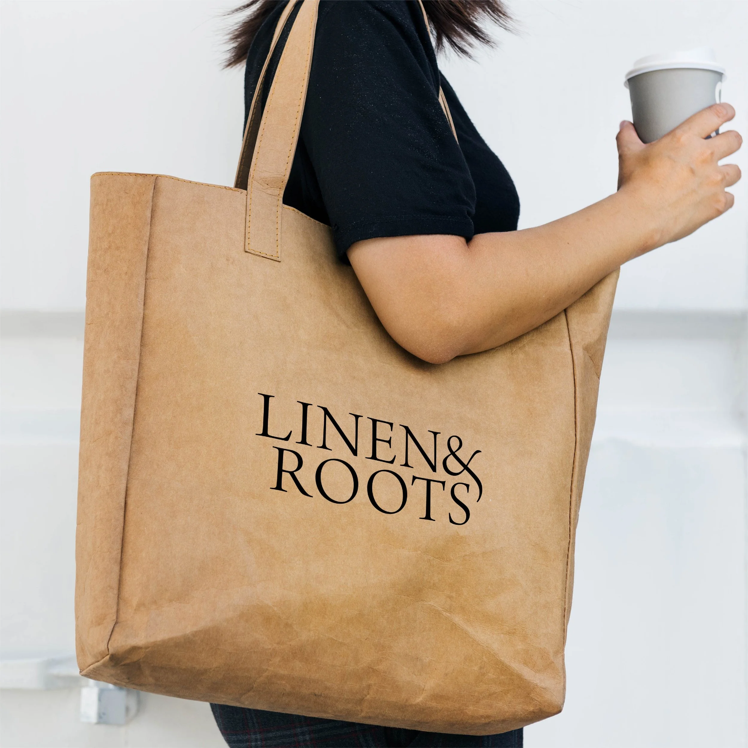
Strengthened brand recognition with a cohesive logo, color palette, and imagery strategy
Elevated in-person visibility through an experiential booth that increased attendee engagement by an estimated 60–70%
Established a scalable design system supporting future product expansion
Approach
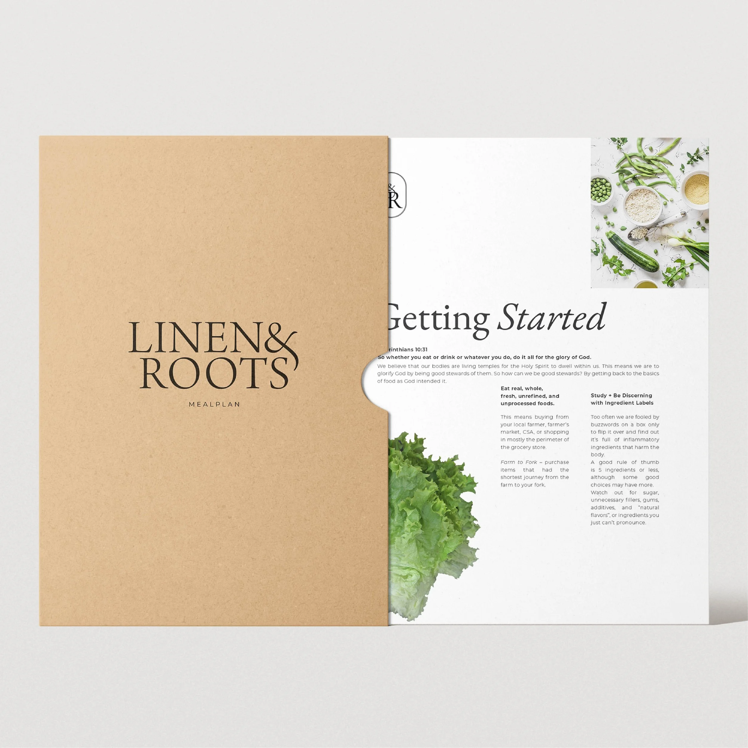
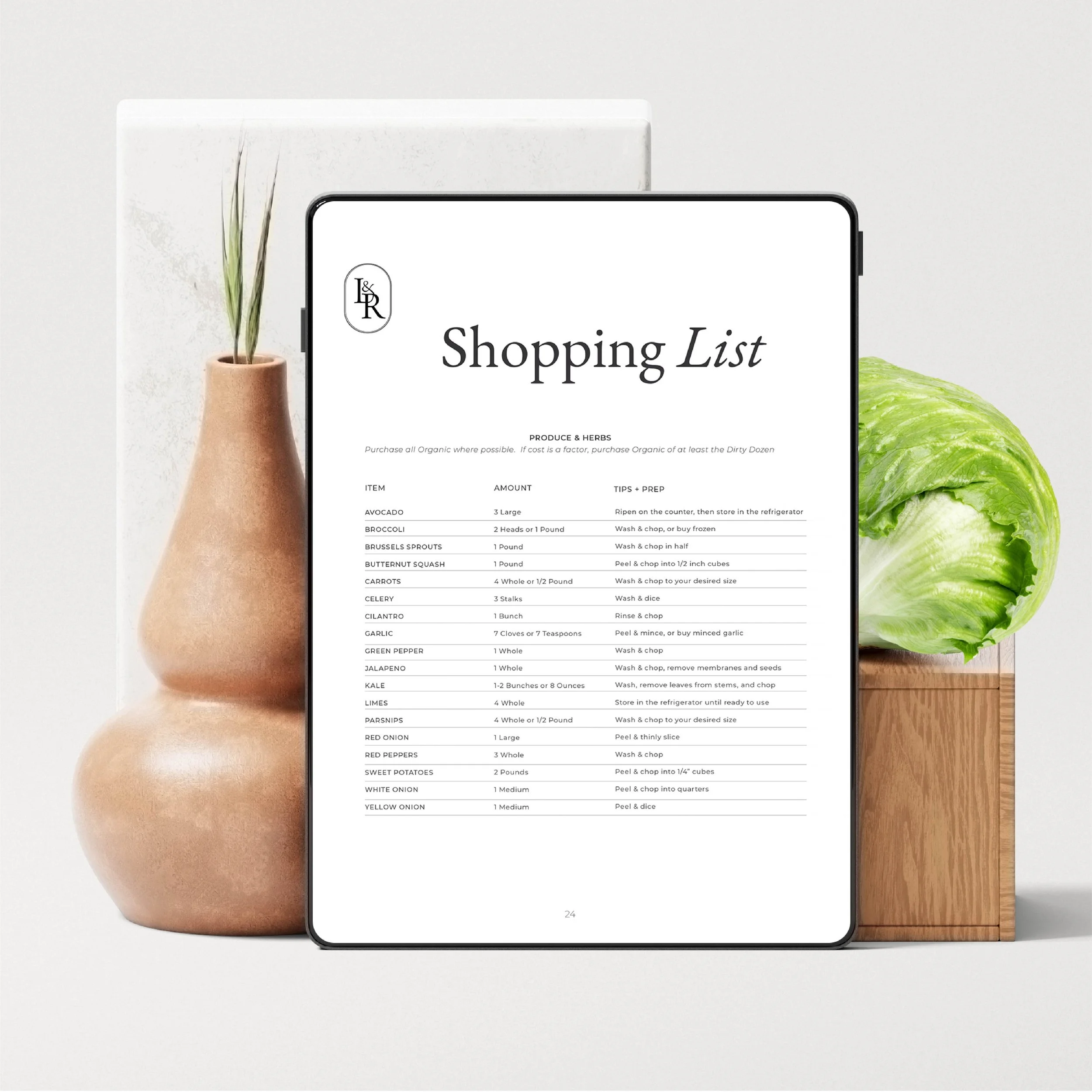
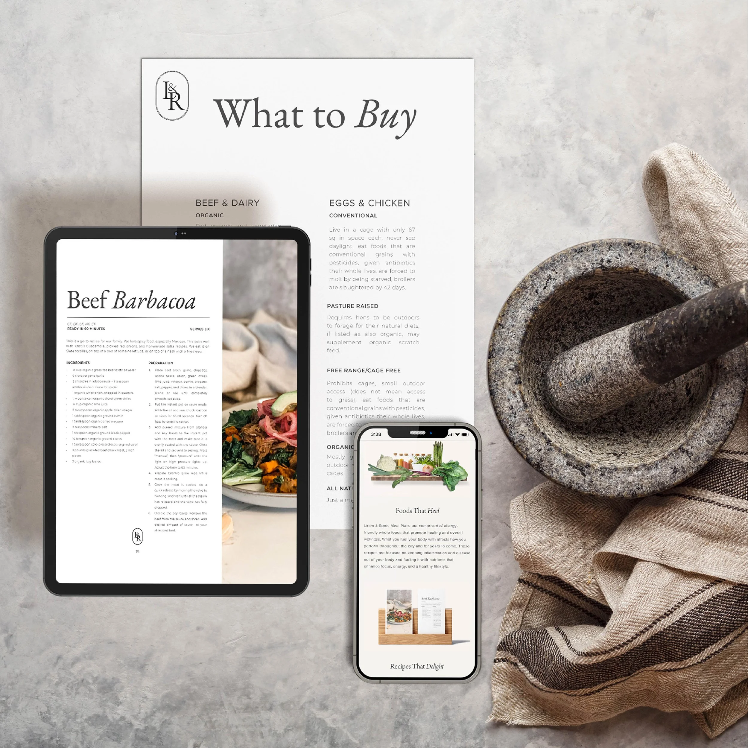
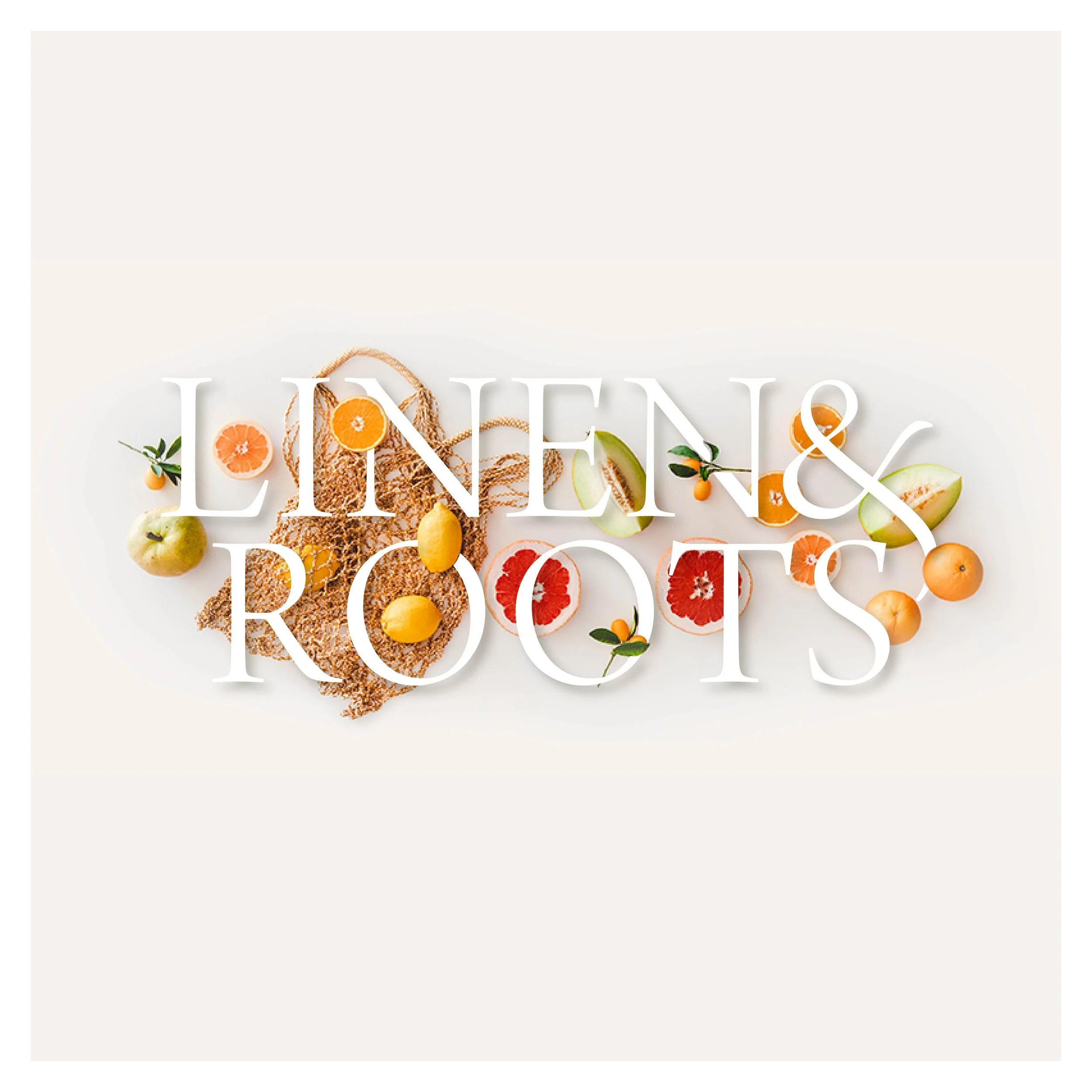
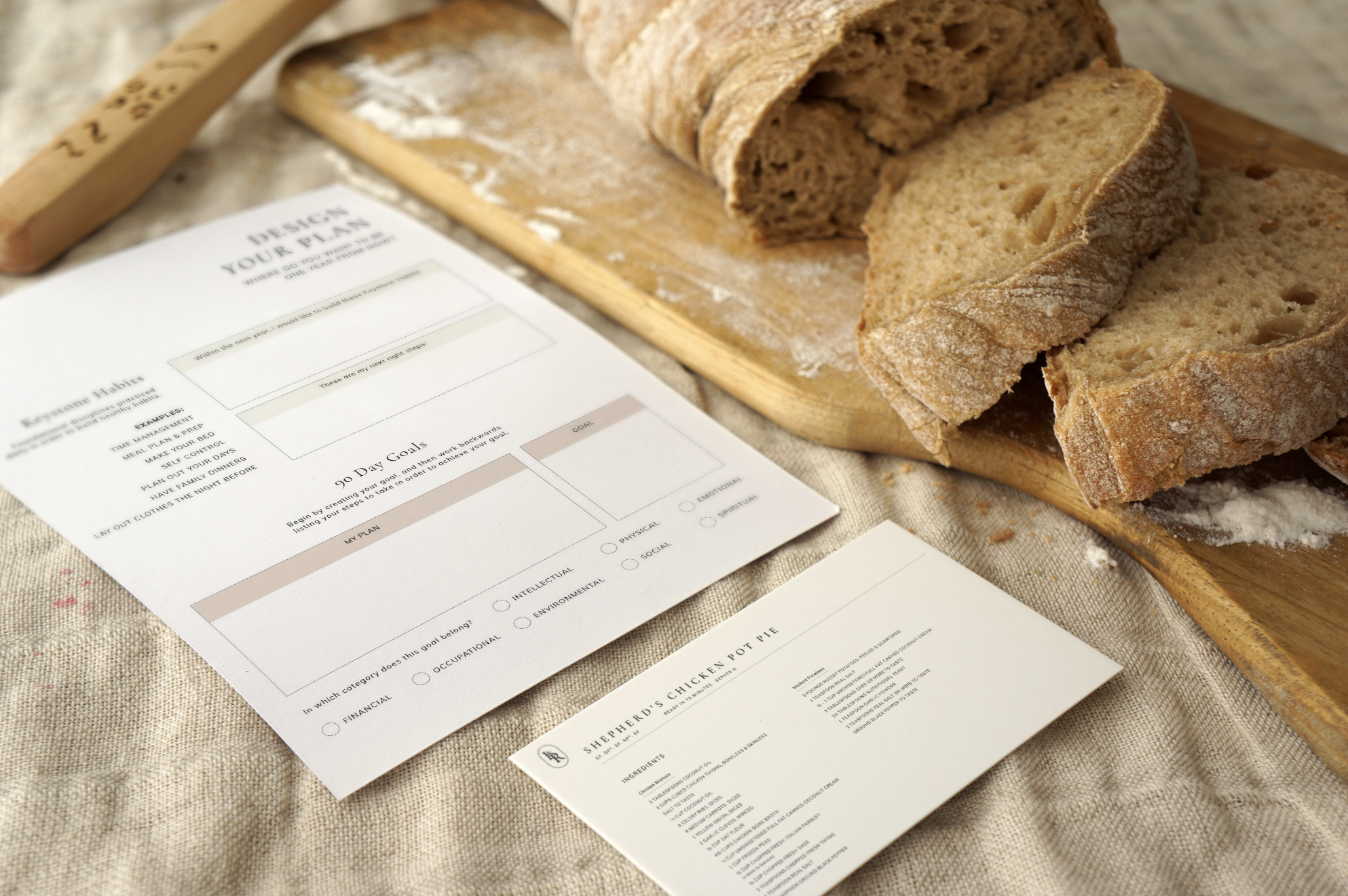
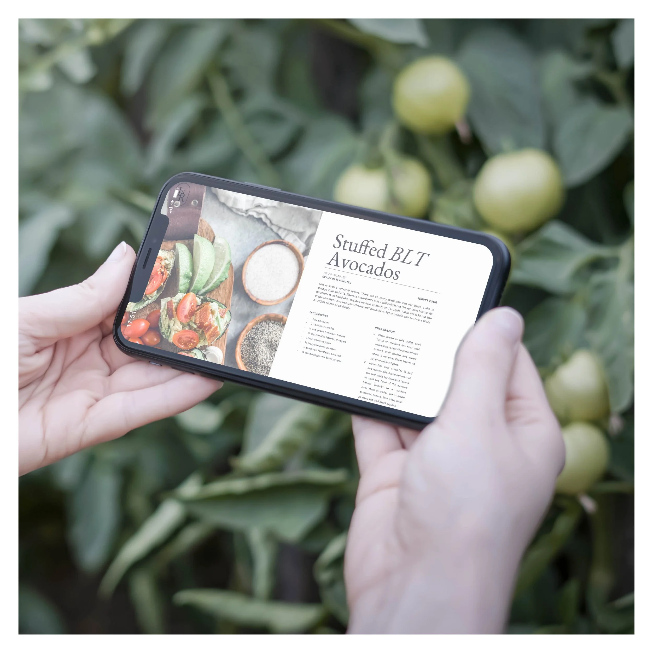
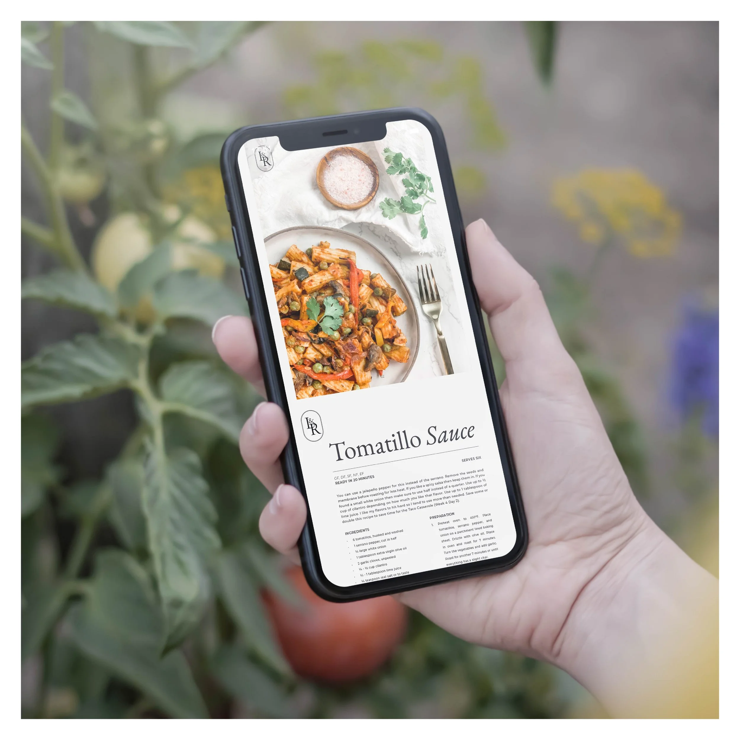
I designed the brand with a minimal, modern aesthetic that allowed the colorful, organic ingredients to be the primary visual driver. This approach carried through the website, recipe cards, and meal plan layouts, creating a consistent user experience across all platforms.
In addition to the brand and digital assets, I developed a full experiential booth for a trade show to strengthen brand visibility. This included:
A produce-based floral installation
A hand-painted banner
Product sampling (soup tasting station)
A hanging art installation using found natural materials
These elements helped extend the brand into a multisensory, in-person setting.
Challenge + Solution
Challenge: Balance the brand’s minimal aesthetic with the rich, vibrant imagery of fresh, seasonal ingredients—without sacrificing clarity or cohesion.
Solution: A restrained visual identity (logo + logomark) paired with high-quality ingredient photography and a minimal layout system. This approach ensured the produce remained the focal point while maintaining a polished, cohesive brand presence across all materials.
Strategy
The strategy positioned Linen & Roots as a lifestyle-focused wellness brand, not just a meal plan provider. Key elements included:
Emphasizing whole-food ingredients as the visual anchor
Communicating the brand’s connection to seasonal living
Using minimal design to convey quality, clarity, and accessibility
Extending the brand through an in-person activation to reinforce its experiential, nature-centered philosophy
Design System
The final system integrated minimal design with organic texture and color:
Logo + Logomark: Simple, modern, versatile
Color Palette: Clean neutrals to support colorful produce photography
Typography: Minimal and highly legible
Imagery: High-quality ingredient photography as the primary visual asset
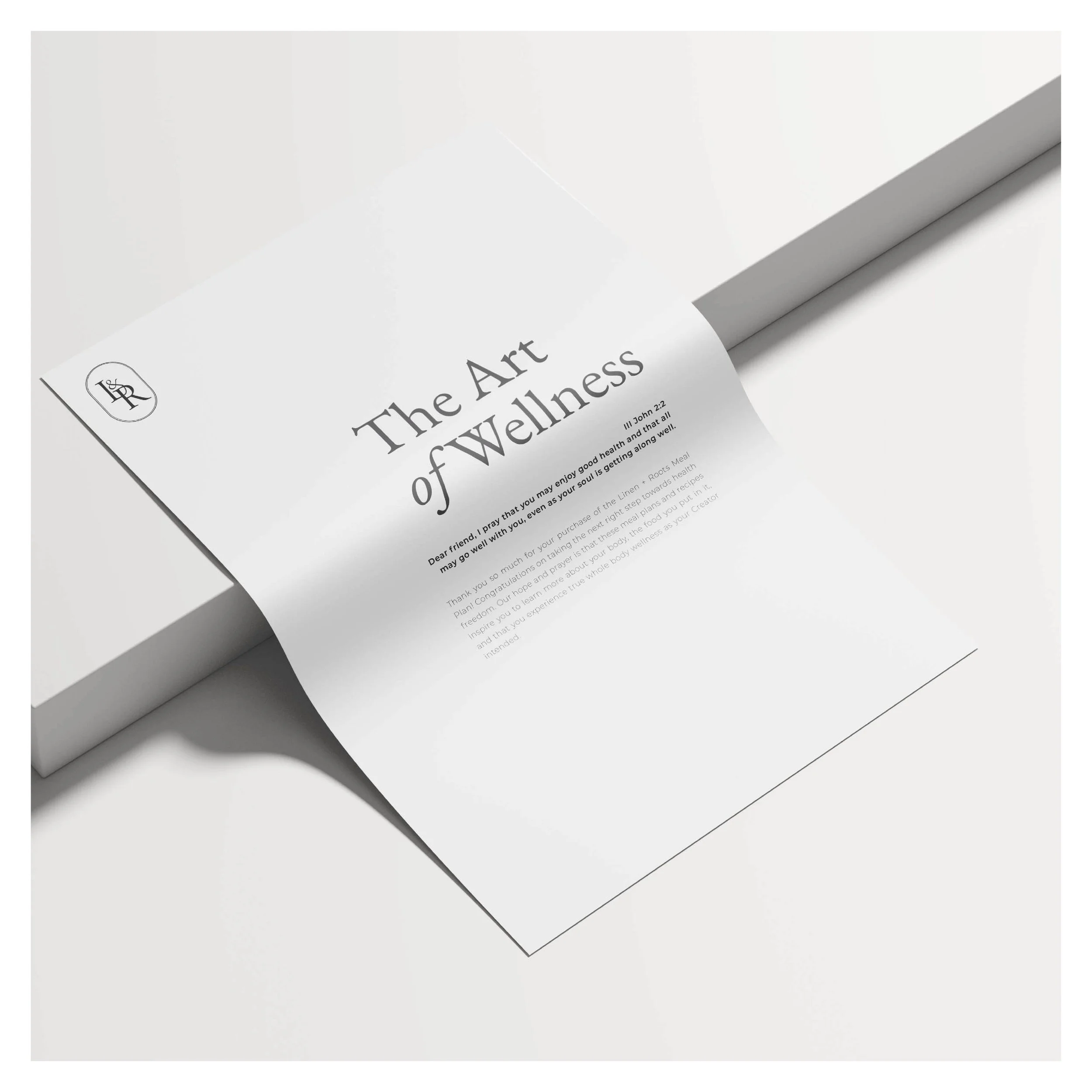
Deliverables: Website, meal plans, recipe cards, marketing collateral, and event booth design
This cohesive system created a seamless brand experience across digital, print, and in-person touchpoints.